Showing posts with label D.Design for MM. Show all posts

Tuesday, May 27, 2008

The Rebirth of a Miracle

Behold the beta version of my Miracle Creatures Icon set! It's now ready for download and free personal usage. Currently this set works with Windows XP. I am planning to get another up for Mac OS X but I need a Mac with Photoshop and maybe a few hours.

In the meantime, please download it and tell me what you think. Enjoy version 1.01, have a nice day. It's alive...

Get M.Creatures WinXP

Thursday, March 20, 2008

Last minute adjustments

logo03

allofit1

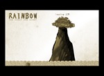
I thought too many colors for the title just felt redundant; sure people think of vibrant colors when you have the title such as 'Rainbow' but what's important is we have a logo that's harmonious with the overall design. Besides we're already subconsciously thinking of all the hues upon ushering that word. Deep in my heart I believe this logo is perfect! The green is a natural variation of green that compliments the overall palette I've set. Created the title-page without the blue effects, just to see if it looks alright overall... does it? I cannot tell, my eyes just saw a zipper on the night sky opening up and I aint' on crack (yet). The storyline, has about four panels to illustrate for this section alone and I think I'm dead meat if I don't do it by next evening. Based on the feedback, I have managed to make a few amendments to the characters section, I'm streamlining the grid as much as possible to save time and space and will be incorporating it to the rest of the interface. That's all I can put up for now I need to go to bed. I wish we had more than two weeks to execute this but maybe... I'm beginning to suspect that's a hidden motive (time-wise) behind this project. Almost done now..

Sunday, March 16, 2008

I don't want to beat around the bush; Foxtrot.. Uniform.. Charlie.. Kilo..

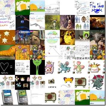
Today's Picture Grid: Fantasy Land's Presentation Kit
collage1

As of today, all updates will be compiled on Windows Live Writer. It's a great standalone as a free offline Blog editing suite, working great for Blogger or Live Spaces(Didn't try it on Wordpress or Livejournal). While it allows me to compile drafts locally I love it for the friendlier image layout mechanism. However you still need to log into the dashboard if you want to update the template but I guess that's alright for now. A real time saver.

http://windowslivewriter.spaces.live.com/
y1prTVdE9ubWJH3q64GgMMbhO2_MWUge8q2FuXU01S60II89SjCX_xk3C179gE-PICeXKb7TE8KkmE

(no I can't teach you how to use it, it's idiot proof for cripes sake)

<Weekend Update>

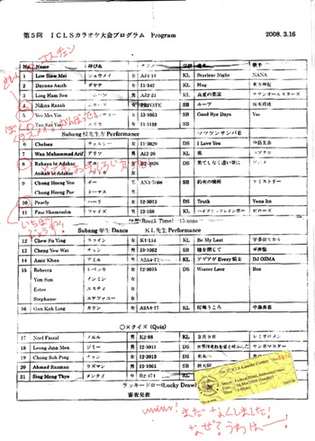
//_ it's 3.48 am Saturday. Everyone's either drunk, euphoric or sexed up. But here I am all alone working on the final changes for the Flash project. There's not much of a choice because tomorrow is the ICLS Karaoke competition at Federal Hotel. No I am not singing, but sensei promised there will be a 'Samba Samurai' show (lolwut) and a lucky draw.

Just came back. And if asked to reflect on what was it all about, I'd probably say:

でっかい楽しいかった!
image

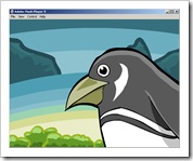
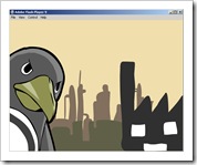
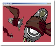
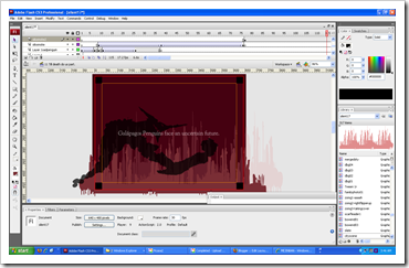
I thought I share this pic, it's a scene where the smoke is chocking the s**** out of the penguin. That's right, another bastardized Evangelion parody.

</Weekend Update>

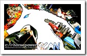
These are the post cards for Design Method's Project 2. There was no presentation so a lot of time was wasted on the rehearsal and Powerpoint preparations. In a never ending pit, project three was disclosed today. It's another week of un-interesting activities.

Haitham, one of my classmates from MM7-1 has started an open forum to represent their batch. I was fortunate to be one of the luck beta testers for it and it's finally online for show. Thing is not everyone from that batch has registered yet so I'm should contribute some artwork to get it going.

[MyArtFolios English]
postcard00 postcard02 postcard01 postcard03 postcard04 postcard05

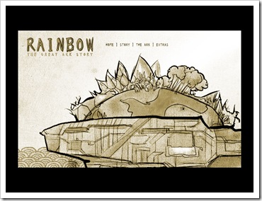
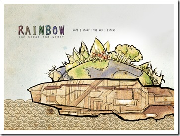
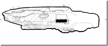
There's not much to be said on the progression of the interactive design, that's because there was not enough time commitment. The changes required are to elaborate the details of the ark, where is the character design (?) and the story start & ending scene. Also the concept of the side game needs to be developed. All in one day. Now how stupid do you have to be, as a student to say, "No problem".

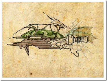
Due to the disappointing lack of time, I have no choice but to cut a few corners from this ambitious concept. Again my classmates have done a remarkable job the renderings; mine pales in comparison but I'll leave it as that for now. I think what's really important at this stage is to finish the project on time for the presentation this coming Friday.
layout2 

Earlier Ark Bird design

mainpage01a

mainpage01ab

The idea for using subtle hues on the background to make the foreground stand out seems like a pretty good idea..
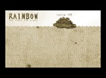
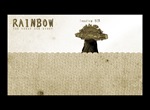
loading01a-Dloading01a-C

loading01a-Bloading01a-A  

arkbird12sketch

arkbird12sketcha

Improving the details..

I could start work on Monday, but I fear there still isn't enough time, Suweii's class has pushed the deadline for the flash project to Monday instead of Wednesday which means I have Sunday to work out the final details. This isn't looking good..
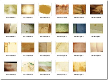
papertext1

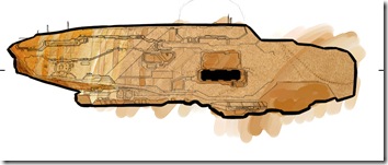
I found some paper textures online to re-substitute to the ark design. I went around the class today and realized holy fudge everyone's using the same paper texture I Googled last Tuesday.

Status report on Digital Media's Project:

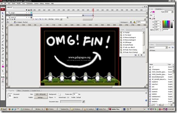
It's 6:10 in the morning and have not slept for 2.5 days. I cannot see my fingers and just realized hey, the Flash Assignment's done. While handing up the file I realized that few of my classmate's final file size were larger than mine. Phew what a relief; the biggest was around 7+ megs, a sign of pure determination(hah). Artistically speaking I noticed they actually put a lot of effort compared to mine on their character design and background details. While I truly appreciated that, I couldn't help wondering why my work got attention when I did not exert equivalent actions. Maybe it's the natural phenomena thing that Penguins are cute.

Update: There's supposed to be a replacement class this Wednesday but Kenny needs the final .swf file and raws by Monday due to some kind of 'competition'.. This is not good.
flashfinbanner1

f1 f2

 f3f4

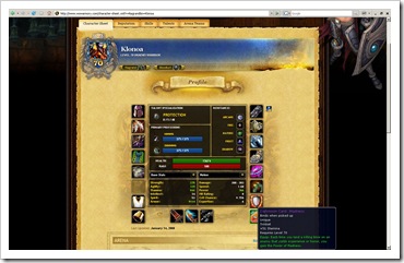
I just logged back into my WoW Armory, and  noticed that my character has been kicked out of the guild (finally?). How sad. If I had time I would really get back to WoW but right now it's suicide to even think about it... Good times. Still remember myself being consumed by all that grinding. What's cool is my gear and stats remain. Maybe I could sell her for a quick buck when the Wrath of the Lich King expansion debuts. But most likely a healer class would be in a higher demand.
ICLS1

kickedout

Saturday, February 16, 2008

Project: Miracle Creatures complete

Update: Well that's done. I'm so elated it's over allowing me to escape to my euphoria in that I discover a miracle to.... uh.... oooooh just gimme some fudging magic before I kill somebody. Did you see a piece of WHD40 gum stuck in one of the feathers? Because I swear on a rainbow broccoli bull moose that it winked at me and oinked. And it healed. Hallelujah.

Icons to be presented:

images removed for security reasons

images removed for security reasons

Vector

images removed for security reasons

Pixel

Wallpaper to be presented:

images removed for security reasons

This is Cosmic Techkippen. He can rawr (This one's rejected but it looks nice).

images removed for security reasons

This is Rubernecking Baby Broccoli

images removed for security reasons

This is a New Zealand Murlock, he says, "Gurrlrlrlrlrlrlrlrlgh!"

images removed for security reasons

"Gurrlrlrlrlrlrlrlrlgh!" *hic*

Thursday, February 07, 2008

Icon Usability Analysis


Finalization on the icons are underway, It would be great if you would like to help contribute your thoughts, feelings and opinions for the the following designs. You're encouraged to be as honest as possible, especially if it means a very 'tough-love' tone. Thanks,

images removed for security reasons

Wednesday, January 30, 2008

We're half way there, livin' on a prayer, take my hand and we'll make it - I swear

Icon Progression Status:
Vectors: Get the highlights done, more emotion(!)
Pixels: Shadows Highlights, where are the gawd dang fires(?!)
Wallpaper: Aiya Seiloh.

Vectors
Candy corn, it's fudging corn, that tastes like candy. And so it goes that we stupid people pass on a legacy of shied. The roof, the roof is on fire, we don't need no water let the motherfudger burn, burn motherfudger, burn.


Pixels
I've got something and it goes somthing and it goes thumping like this. All you need is my un tiss un tiss un tisss baby un tiss


WIP: Vector Wallpaper
Thank you. You totally made me miss Damages last night *spit* Should have recorded it *Spit Spit* That's why here to fill that opening again.


Tuesday, January 29, 2008

Too many bloody songs about rainbows

SWATCH Analysis (Lol): A report on the color selections project X


If you walked into a Japanese garden, you'd probably be smacked down in the face with these hues. Unless you're stupid enough to visit during the other seasons where they won't match.


Did you remember those 1940 superhero comics? I'm Filo so prefer Batman.


This is why you should never scan an ad from IKEA, the blue cannot match the actual one but it does feel like it right? Wrong. It was a lie.


The petals from Van Gough's Sunflower. Maybe maybe not.


Color scheme from Gundam's RX-78. OMGLZRGUNPEWPEW


This one in particular reminds me of Aerosmith's song, "Pink". However you shouldn't listen to him too much. You might get caught in the shower thinking you're better at singing.

Friday, January 25, 2008

Progression unending


Need to think of the colors, confirmation on the last two icons required


Oh for cripes sakes take this away and feed it to the crocodiles.


Comments on swatch layout, update soon


Preliminary rounds for the wallpaper, gonna do this all in illustrator, hehe.

Sunday, January 20, 2008

Part IV: A less stylish approach, Gloriosa Generosa

Summary:
  • The new banner WiP
  • Progress on the mobile icon designs
  • Tons of rubbish that's important to me
I thought that creating a custom title header would liven up things up around here. As part of the subject curriculum , here's a few shots of the process.

Sketching out the panels
Here was the initial idea; rather than having a bunch of typography/design elements or background-digital-manifested-thematic greeting system plotted, I thought it would be pretty cool if I went back to basics and just plop some servants to greet the audience. The answer was to have two lovely young volunteers which would be Akazukin and Mirai. Domo arigato gozaimasu, hime sama.


Inking is the devil.
I have to be honest with you, This is not Manga. Manga art is clean, beautiful and elegant. This style is mother fudging messed up. This would be fudging fail if it were to be passed up as figure studies homework. Therefore it is more than perfect for this blog.


Giving some... no. Just a little bit of depth
Hurry hurry this should have been done half and hour ago.


Progress on 'Fantasy World' iconography:
The next refinement process is to add 3/4 angles for the vectors and making the pixel icons prominent. The 'satellite' icon needs a new direction.


Testing this one